Released on Xbox 360 / PS3 / PC.
For the retail release I was brought on to help bring art assets into the game, with secondary design duties like designing icons and secondary screens. At this point no-body had ever heard the term 'UX', so it was sort of a free for-all design process and collaboration with design. It was sort of crazy but an incredible learning opportunity.
FEAR's major gameplay gimmick was the ability to go into slow motion and decimate opponents. Design was having a frustrating time making the slow motion meter easy to read while also not being distracting to action. Originally it was tucked away into one of the corners, but I decided to change it to a small circular meter near the cross hair- not too distracting but not too difficult to see. This worked out fantastically- everybody loved it since it made the mental flow of using slow motion to your tactical advantage a lot snappier and satisfying.
FEAR 2: REBORN DLC
In the DLC expansion mission, due to the context of the story (playing as an enemy soldier) I was given the freedom to re-work the HUD. One of the major things that bugged me in the retail version (and still to this day) was the constant presence of the techy HUD frame art direction wanted. So in the DLC I was given the opportunity to re-skin and auto-hide as much of it as possible. I even managed to time it with a major story beat in the early part of the DLC- the player starts out with a noisy tech HUD as they are soldier being heavily mind controlled, but suddenly they are broken free of the control at which point I had the HUD switch to a super minimal presence to convey the sense of disconnection. Honestly having the HUD auto hide also significantly improved immersion, I feel.
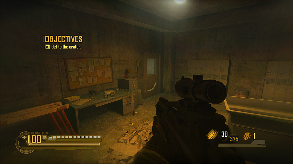
Example of the DLC full noisy tech HUD (with the weapon select display active).

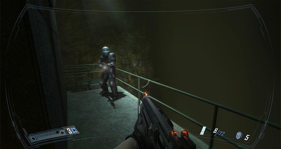
Example of the minimal disconnected HUD (with the current objective temporarily showing). Pieces like the ammo and health would fade out independently based on the actions of the player.